

This blog is a continuation of the Progressive Web App (PWA) postings and covers the Responsiveness characteristic of PWA. In a nutshell, Responsiveness is the ability for your web-app to resize and re-format the content displayed on a user’s web-browser. So if the web-app is running on a laptop, it’ll resize and optimize itself for laptop viewing. And when the app runs on a smartphone, it’ll automatically resize to fit that screen’s format.
In addition to resizing, Responsiveness also allows your web-app to display certain content or action-buttons in a format that’s suitable for the target device. For instance, when your web-app is viewed on a laptop, you might see the menu presented in the image below. You can see that each of the menu choices are visible.

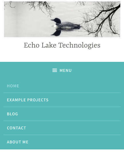
Next, here’s what the closed menu would look like on a mobile device. The symbol shown to the left of “MENU” is commonly used to represent a menu, particularly on mobile devices.

And here’s what the open menu would look like on a mobile device
Adding Responsiveness to your web-app in bubble.is is fairly straightforward and there are a couple of ways to do it. The first way is by using the Progressive Enhancement capabilities in bubble.is which are covered here and introduces the use of “Mobile version” in bubble.is.
The second way is to implement Responsiveness in bubble.is is use the Responsive tab found in the bubble editor (see image below).

By using the Responsive tab, you can setup rules for the various “elements”, i.e. buttons, text, input fields, etc, in your web-app. For instance, referring to the earlier example of the menu, you can setup a Responsive rule in bubble.is to automatically show a “full” laptop view when the user is viewing your web-app on a laptop. Similarly, a Responsive rule can be setup to show the mobile version of the menu when the user is on a smartphone.
If your app has pictures in it, you can setup the behavior of the picture’s proportions as the browser screen gets resized (see image below). This way you can add a picture and regardless if it’s viewed on a laptop or a mobile device, bubble.is will automatically keep the picture’s proportions intact so the picture doesn’t get distorted.

Bubble.is has a lot of capabilities to allow you to control your web-app’s Responsive behavior across laptops, tablets and smartphones. For more detailed information on how to setup Responsive behavior in your web-app, please check out this video from bubble or contact me.
Summary
Having Responsive capabilities is an important Progressive Web App (PWA) characteristic to have in your web-app design. Fortunately, bubble.is has multiple built in capabilities to make Responsiveness easy to implement. Try it out – your users will thank you.
 Echo Lake Technologies
1 thought on “Responsiveness with Progressive Web Apps (PWA) and Bubble.is”